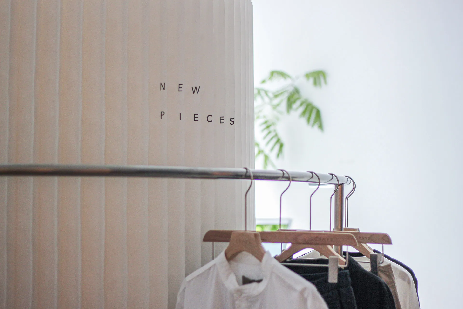

A spatial & brand agency
I AM A
BRAND OWNER
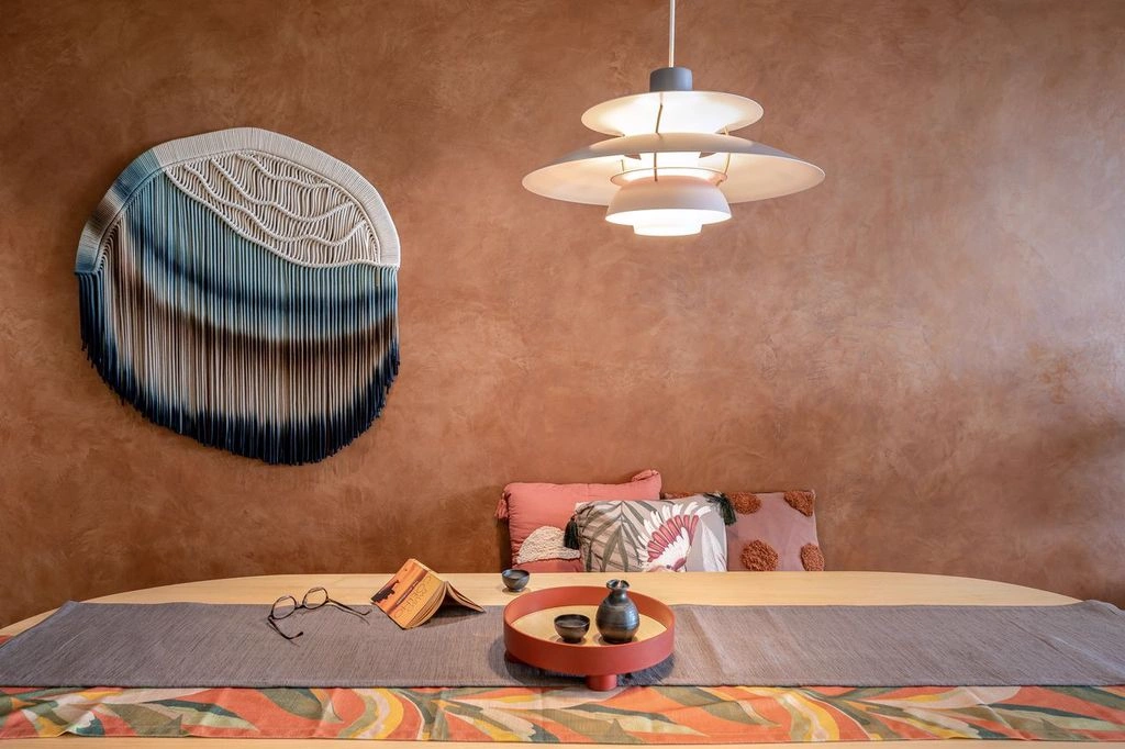
A spatial & brand agency
I AM A
HOME OWNER